Why the Responsive Design Trend Is Becoming the New Industry Standard

Table of Contents

    Subscribe for Email Updates

    According to SearchEngineWatch.com, mobile Internet usage increased by over 73% in the year 2014 and now exceeds PC Internet usage for the first time in history.  This means that businesses should consider responsive web design as a solution to ensuring their website is compatible across any and all devices.  

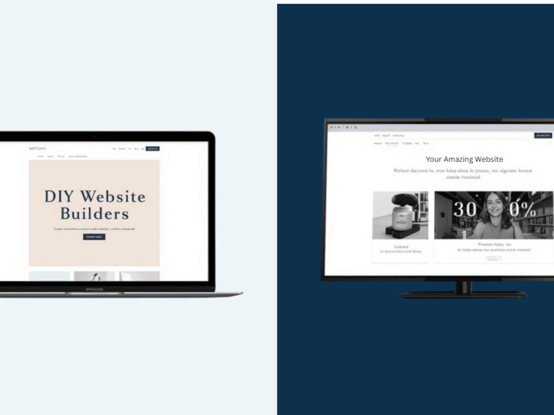
    Responsive Web Design is often misunderstood as a term to describe any website that appears “mobile-friendly”, but there are many differences to an actual responsive site and a site that merely appears mobile-friendly. Responsive websites use one single HTML code that fluidly changes the size of the site using CSS as the size of the user’s device changes. The key difference is in the amount of HTML codebases: a responsive site will always have only one, while a dynamically-served site will have multiple codebases that a server will choose from depending on the size of the device detected.

    With so many mobile users in the world, it is critical to have a website that responds to the variable screen size rather than scaling down to a lower resolution. A website must appear beautiful on all kinds of devices - from a 50” television to a tablet, a laptop and every phone in between. There are many strategies for developing a mobile-friendly website, but choosing a responsive web design offers additional benefits that increase user-experience and aid in business:

    1. Flexible web page rendering: the user will always experience a 100% width website that is adapted to their particular screen size. There will never be a need to zoom on a responsive website because the site has already adapted to the user.
       
    2. Search engine optimization (SEO): Google, the largest search engine to date, dictates what search engine optimization practices websites need to adhere to in order to be found. Google has clearly indicated that it prefers responsive web designs to mobile templates because there is a single website URL to crawl and index the website. Likewise, there is a greater reduction in search engine optimization errors because all occur only once rather than for desktop and for mobile.
       
    3. Easy long-term maintenance: using one HTML file structure for the entire site means less development on the backend. Less development means time efficiency and a lower cost when making changes and maintaining the site.
       
    4. Bounce rate reduction: User experience strongly dictates your business’s bounce rate. If there is a consistent user experience among devices as well as an ease of navigation, the website is considered more trustworthy to the user. The easier to navigate, the longer a user is likely to stay on your site.
       
    5. Easy sharing: Instead of detecting multiple URL’s (such as m.title.com and www.title.com), responsive web design only uses one URL that allows for consistent and easy sharing among all users, devices, social marketing platforms, and experiences.

    As technology evolves, websites- how they are designed and how they are built, will adapt further, (perhaps even into 3D?). 5.1 billion people in the world of the 6.8 billion-world population are now smartphone users. While responsive design may not be feasible for every business, it is a great option to consider when considering your customer base. 

    Related Tags:

    About the Author

    Emily Oskay Gerrick

    Emily joined the Marketpath team in December of 2014 as a User Experience (UX) Designer. She serves as the product designer for Marketpath CMS, and the lead designer for the Pro Services division. Emily works directly with clients to establish their online marketing goals and outlines any functional requirements the custom website may need before designing client websites.

    Emily obtained her Masters of Science in Information Architecture & Knowledge Management with a concentration in User Experience Design from Kent State University in 2018. She previously attended Purdue University and graduated from Purdue University in May of 2013 with a B.A. in Visual Communication Design and Computer Science. In her free time, Emily enjoys cooking, drawing and designing, traveling the world, and spending time with her family and friends.

    Subscribe for Email Updates