Most contractors do not lose jobs because they do poor work. They lose them before the first phone call.
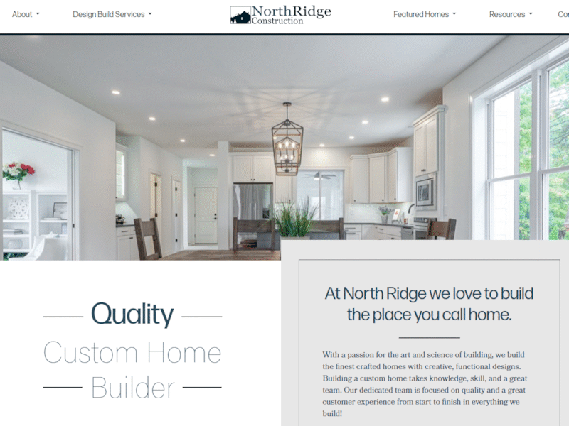
A homeowner searches for a remodeler. A property manager looks for a tenant improvement contractor. A business owner needs a buildout done quickly. They land on your website, take one look around, and decide whether you seem organized, trustworthy, and capable of handling the job.
That decision happens fast.
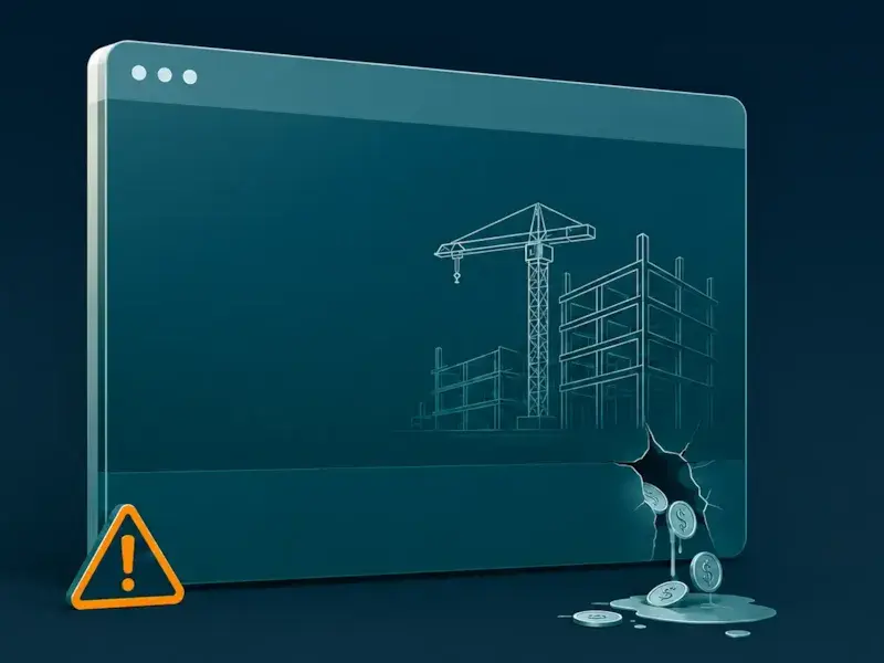
You may have the best crew in your area. Your projects may finish clean, on schedule, and on budget. But if your website looks outdated, loads poorly on a phone, or makes people hunt for basic information, good leads will move on to the next contractor who looks easier to trust.
Here is the simple math. Say your average project is worth $25,000. Missing one qualified lead a month puts up to $300,000 in potential annual revenue at risk. That is not a small website problem. That is a business development problem.
Your website should not just “exist.” It should help people understand what you do, where you work, why you are credible, and how to take the next step.
Here is where most construction websites start leaking money.
When someone lands on your homepage, they should not have to decode your business.
They should know three things within a few seconds:
That means your homepage headline should be plain, not clever. “Custom Home Remodeling in Austin” is stronger than “Building Your Dreams With Quality and Integrity.” The first one tells people exactly what you do. The second one could belong to almost any contractor in the country.
Do not upload 50 images into a gallery and expect visitors to figure out the value. Add context. Explain what the client needed, what problem your team solved, and what changed after the work was finished.
For example:
A cramped 1960s kitchen became an open layout with custom oak cabinetry, new lighting, and a better connection to the dining room. The project stayed within the original budget and was completed before the family’s move-in date.
That kind of detail does more than show the work. It proves you understand planning, communication, and execution.
Single-page websites can look clean, but they often create problems for construction companies.
When every service is squeezed onto one long page, search engines and customers get very little detail. A homeowner looking for “kitchen remodeling near me” does not want to scroll through roofing, additions, bathrooms, decks, and commercial work before finding the section that applies to them.
Dedicated service pages are stronger.
Instead of listing “remodeling, additions, bathrooms, kitchens, decks” in one bullet list, build a real page for each core service:
Each page should explain the service in plain language, show relevant projects, answer common questions, and include a clear next step.
This is not about stuffing keywords onto a page. It is about matching the way customers actually search. People do not search for vague contractor slogans. They search for the job they need done in the place they need it done.
A page called “Kitchen Remodeling in [City]” gives both the customer and Google a much clearer signal than a general services section buried halfway down the homepage.
A construction website can have strong photos, good copy, and great testimonials, but still fail if the contact process is clunky.
On mobile, your phone number should be easy to tap. Your estimate button should be visible without forcing people to dig through the menu. Your forms should be short enough that a serious prospect can complete them in under a minute.
A good estimate form does not need to ask for everything at once.
Start with the essentials:
That is enough to start a useful conversation.
You can gather budget details, measurements, photos, and scheduling information later. The first goal is to remove friction so the right people can reach you quickly.
Give visitors more than one way to act. Some people want to call. Others prefer a form. Some may want to text. The easier you make the first step, the fewer leads you lose.
A stale website is a common problem in construction.
The company finishes strong projects all year, but the website still shows the same old photos from three years ago. That usually happens because updating the site is too difficult. The owner has to call a developer, wait on someone else, send files around, and hope the update eventually gets posted.
That process kills momentum.
Your best marketing asset is often the job you just finished. A clean kitchen remodel, a polished office buildout, or a well-documented before-and-after can do more for trust than another paragraph about quality craftsmanship.
Your website should make it easy for your team to publish recent work.
A simple project update should include:
You do not need a long case study every time. Even a short project note is valuable when it shows fresh, real work.
The goal is to make your website feel active. Visitors should be able to tell that your company is busy, current, and proud of the work being delivered right now.
A good construction website does more than bring in more inquiries. It brings in better inquiries.
That means your site should help the wrong-fit prospects self-select out and the right-fit prospects feel confident reaching out.
You can do that by being clear about:
This does not mean you need to publish exact pricing for every job. Many construction projects are too variable for that. But you can still set expectations. Explain what affects cost. Explain what information you need to provide a useful estimate. Explain how your consultation or bidding process works.
Clarity builds trust. It also saves your team from wasting time on leads that were never a fit.
Your website should be working while your crew is on the jobsite.
It should help potential customers understand your work, trust your process, and take the next step without confusion. It should show recent projects, load well on mobile, support your local search visibility, and make contacting you easy.
When it does those things well, it becomes more than an online brochure. It becomes part of your sales system.
Not sure whether your current site is helping or hurting? Run it through our free Website Grader. You will get a clear report on performance, SEO, mobile readiness, and security.
Download the 2026 Construction Website Blueprint and see how we build contractor websites designed to win better projects.