How do you optimize your conversion rates when you're running a email drip, account based marketing, PPC, or direct-mail campaign? You send them a link to a stand-alone landing page designed with only one purpose: Convert prospects to leads.
Visual design and compelling copy influence the user's reaction to your landing page. Combining the two is a balancing act, but we're advocates of putting the customer first. What draws (and holds) their attention? Does your landing page keep the promises made to get them there?
Landing pages, in spite of their apparent simplicity, are built upon research, testing, and proven design principles. If yours isn't delivering the ROI you expect, it might be time to re-evaluate your best practices.
Here's how to create a landing page that will put you on track. Once you've nailed the fundamentals, you can refine your virtual billboard using data collected from traffic analysis and testing.
As soon as the page loads (and loading speed should be lightning fast) boom—your visitor should see exactly what you want them to see with minimal distractions. This is where you place your pitch and CTA.
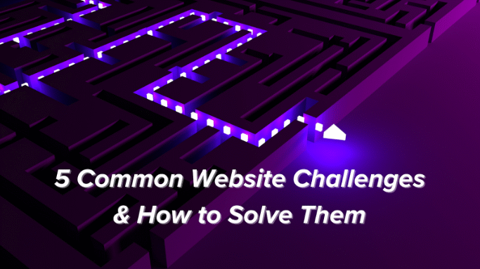
Too many navigation prompts cause confusion and indecision. You want your visitors to click that CTA button like a rat in a Skinner box, not run through a maze weighing their other options. Most UX designers recommend deactivating the navigation bar on landing pages.
You can (and should) place supporting content below the fold—also an ideal spot for testimonials, client logos, and blog posts or news related to the landing page promotion.
Just remember that once your visitors venture beyond the fold, they'll benefit from a clear navigation structure. A recent Crazy Egg article about navigation best practices laid down the law: "Your website navigation structure should allow someone to land on any page on your site and find what they need within 3 clicks." That first click? Your landing page CTA. Make the next two count.
Studies that track eye movement on web pages give us insight into how readers skim through or dwell upon content. We highly recommend this Nielsen Norman Group article on the "F pattern" for valuable insights into creating the most impactful landing page copy layouts. The takeaway: Position your copy so the most critical information is in the upper left quadrant of your landing page. Your readers will absorb that information, which will then "point" their attention to the opposite side—a great place for a signup form, infographic, or image of the product or service you're promoting. You might want to consider adding a video in this area on your landing page if it helps your visitors gain a practical understanding of your featured product or service, or elevates social proof with an influencer endorsement.
Your goal is to give your audience just enough information above the fold to compel conversion. Plenty of white space, pleasing colors, and easy-to-read typography is literally easy on the eyes. You only have a few seconds to make a first impression. Don't overwhelm your visitors with unnecessary content.
You already know that mobile users account for roughly half of all traffic. It's not enough for your landing page content to "fit" into smaller formats. Design landing pages that translate best design practices to mobile screens.
How are your visitors reacting to your landing page? Do you have a frame of reference? Use data gathered from A/B testing, Google Optimize, and heat maps when comparing one or more landing page versions, and re-test every four to six months. Be sure your content management system supports iterative design strategies and that you remember your data-backed buyer persona comes first, far ahead of your own aesthetic preferences.
UX works both ways and agile content management systems make it easy for marketers to create landing pages that convert. If you're on the lookout for a new CMS, ask for free demos. Choose a platform that's intuitive to you so you'll be enabled and inspired to create and refine the most intuitive and effective landing page for your campaign. The right CMS makes it easy to apply landing page best practices and respond to market pivot points with agility and purpose.
Marketpath CMS prepares its users for the internet's ongoing evolution with seamless, automatic updates and independence from vulnerable plug-ins. Find out how easily you can migrate your site to our user-friendly, feature-rich, and environmentally-agile platform.