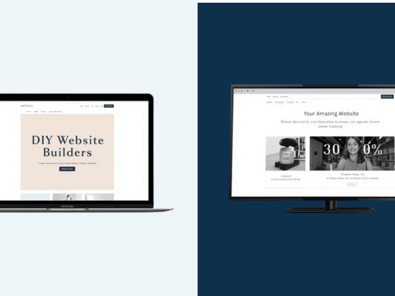
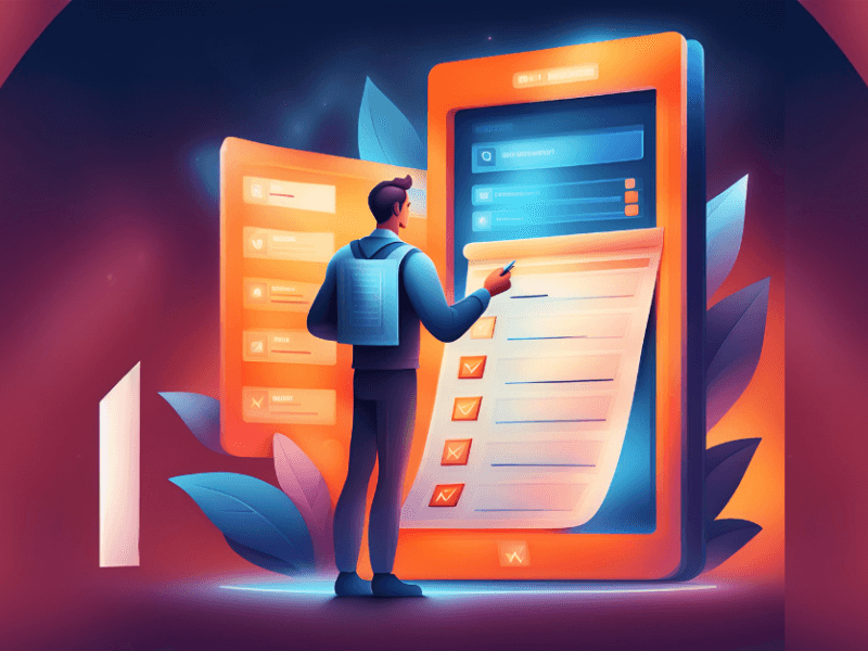
Humans are creatures of habit, therefore unless all of your users are of the four-legged variety, your users are creatures of habit too. UX/UI Design is not, in fact, form over function and neither should your button placement. Additionally, it is important to use clear language and contrast in color and design to clearly guide the users to the primary action as well as make them fully understand what the button action is.
The first rule of buttons is that users are trained for certain types of button placement, and here are a few you should consider as standard:
If a button functions as a way to close a window, tab, or pop-up screen, your users are inherently going to look in the top right or left corner of their window for a close button. You are trained to do so by every word processing program and internet browser you’ve ever opened to do so. You’ll notice a trend as of late in advertising (think of the pop-up ads in your Candy Crush game) is to explicitly move this button into a different corner to trip you up, often putting their call to action where you would inherently click on the close button. Whether you choose right or left, be consistent in its placement and functionality.

Buttons for a primary action typically work better on the right side of a pop-up dialog. The reason for this is a user associates “ok”, “save”, or any similar action with progress and moving forward. Secondary actions like deleting, discarding, or canceling should appear on the left and in a secondary weight and color if they are not the primary intention of the dialog.

Additionally, it’s important to use clear messaging and contrast to make users quickly and clearly understand what will happen from their actions.
A good rule of thumb is not to use “Yes”, “No”, or “Ok” unless it is to comply with something such as the use of cookies on your website. Even then a clearer action would be “Yes, I accept” or “Ok, I Understand.” Be clear and explicit to avoid confusion. A confusing, permanent action can lead to data loss, a rise in support issues, or less conversions or sales.


Lastly, don't forget how and where you're using these buttons. A button on a desktop can be a lot easier to click with a mouse than a small button on a phone with your finger. Ensure you review all of your buttons on mobile to make sure they're appropriately sized and usable.


