
Marketpath CMS offers an extension to our image editor interface that we call Image Presets. Image presets are simply groups of settings that are easy to apply to edited images in the future and are easy to apply to images in templates. This gives the user or the developer control to dynamically resize images "on the fly" so that they are the correct size or aspect ratio. You can even add "special effects" such as alpha transparency, rotation, and more if desired.
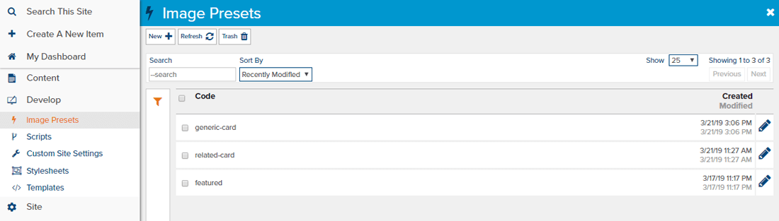
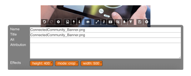
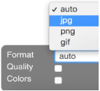 Image presets allow you to change the file type of an image if you need a different type of image. If an image is a JPEG and you add a drop shadow to it, you’ll be able to save it as a PNG so that your drop shadow will be clear over whatever color background you insert it into.
If an image is displayed on a blog feed as a thumbnail, 150px square, with a 2px gray border, but the same image is displayed as a large banner on the blog post, an image preset would come in handy for creating both. Outlined in this example is how an image preset would benefit consistency for creating the blog feed thumbnail shown on many websites.

If you are a content editor, you could: Use the image editor interface to edit the image. You would resize the image to be 150px in either height or width (whichever is the shorter side is 150px) and then crop the image into a square 150px x 150px from the left, right, top bottom or center of the remaining image. After you have your cropped and resized image, you would apply a 2px gray border and then save the image as a copy. Additionally, you would create a new image preset in the same interface that you hit save.
The next time you write a blog post, rather than going through the process outlined above, you can start with “apply image preset” and get ~50-75% of the way there. I say a range because you may have to adjust the orientation of your crop in the instance above. If you previously defined a crop from the upper left to capture the sun, but your new image needs to focus on the bottom right flowers, you can remove the layer orienting the crop to the upper left and reapply a crop from the bottom right. It’s not a perfect science but it saves time, improves consistency and branding, and delivers a significantly smaller image which is key for page speed.
If you are a developer, you could: Write into your partial template an image preset that defines the image styles for your blog feed thumbnail. You would set up the image preset using the same interface outlined above, and you will tell the preset to resize the image to be roughly 200-300px and then crop the image to be 150px square from the center. Because you will not know the exact size or orientation of the image that is uploaded when you are editing “on the fly”, resizing the image to a smaller size but not assuming the image is already square or a certain orientation is key. Then on top of that you can set a crop of 150px from the center to ensure that, in theory, the “main” part of the image is contained in the thumbnail.
The syntax added to the template is fairly simple. You can target whichever piece of the entity you prefer - the Name, the URL, the GUID or the image. In our situation because we’re looping through potentially several images in a single feed, we’ll target the img blog.image, set it to link or not, and apply the preset:
Template: {% img blogpost.image link:false preset:"thumb250" %}
Output: <img src="http://www.domain.com/path/to/altered/img.jpg" alt="Image Alt Text" title="Back to Home Page" width="Image Width" height="Image Height" />
Another cool situation for developers and image presets is the ability to define different breakpoints (such as desktop, tablet and mobile) within their templates and style sheets and deliver different versions of the same image through image presets. So if a banner image, for example, changes in size, shape or orientation from one breakpoint to the next, you can render different versions of the image per the instance.
If you’re a developer and you’d like to learn more, visit our help website for the full syntax and examples on image presets.


