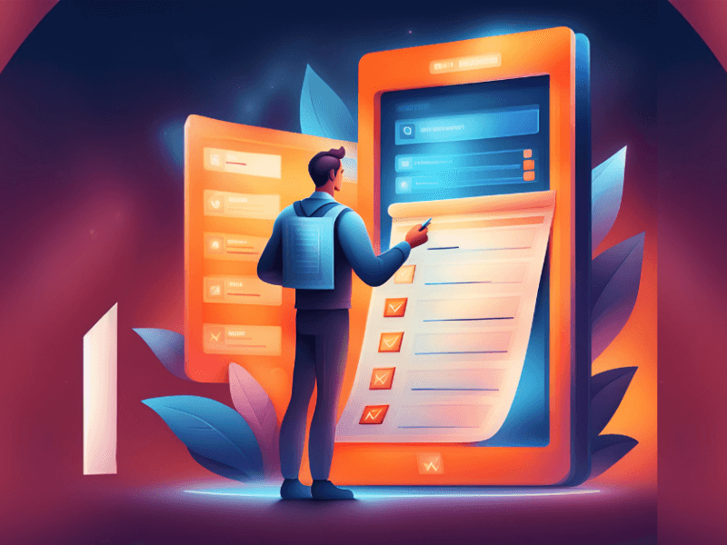
Falling in love with new software ideas and features is easy because they quickly solve a challenge or you think they’re the next big thing. Thankfully, you can easily find out whether your ideas have value to your users utilizing user testing to refine a product or feature. You can ask the user “Do you want this? And can you use this?” during user testing to easily seek feedback.
Not very romantic, I know, but at least we won’t end up wasting resources and time designing the wrong thing or the right thing in the wrong way, much less developing it. It’s all around safer and simpler to be given direct feedback, even if the feedback is negative. Qualitative feedback may cost some money, but when done correctly it can bring huge amounts of clarity to a product roadmap.
When users become stalled or confused, especially in the early stages of a product, they lose faith in that product and sometimes never return. It is important to be clear, direct, and honest with your users in order to gain their trust and support.
How can we do this? There are a number of different ways but it’s important to follow these basic principles:
Repetition - Repetition and consistency provide clarity to a user. Good software will teach a user through repetition and consistency how to perform their goals. For example, to publish content to a website, a user should have a button in the same place for every screen no matter what type of content is being published. A user will always know where to look if it is always in the same place.
Color - Color is one of the easiest ways to convey emotion, direction, and attention. It is important to consider ADA compliance when choosing your colors, especially when designing software products. Use a websafe color chart or a color contrast reader.
Contrast - Contrast helps elements stand out. We can use color, depth, and size to convey contrast to draw a reader’s eye in one direction or another.
Copy - Last but not least, there’s the wording itself within a software or an application. Be clear and literal to avoid confusion for your users. Test different ideas to find the appropriate nomenclature when designing a new feature and gain feedback from your users. Provide proper documentation and tooltips throughout a software to educate the user and provide clarity.
Don’t overload your visitors with too many choices. Hick's Law states that the time it takes to make a decision correlates with the amount of choices the user has to make — too long, and the user won't make a choice at all.
How do we avoid too many options in a software?
Keep layouts minimal in order to help users make clear decisions quicker.
Use repetition balanced with context because what’s important on one screen may not be important on the next, but maintain consistency in repeated actions.
Track behavior of your users, utilizing heatmap tools, and then perform A/B testing on your layouts. These tools can test layout changes with a fraction of your users before fully releasing to them.
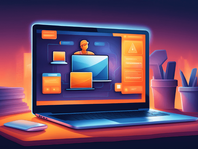
Consistency heavily contributes to user experience. The brain is designed to develop shortcuts and repeat things unconsciously after regular interaction, also known as habit-formation. This is why Operating System updates that dramatically change user interface can upset users for a period of time. What they are used to has changed, and they have to re-learn.
While we understand your software or website may need a major facelift every few years, it is important to adapt and maintain design consistent patterns, common UI (example, sharing buttons, menu icons, etc.) in order to better engage your users.
Users aren’t always customers, but customers are typically users. Don’t fall into the “churn and burn” trap of gaining new clients, training them, and forgetting about them. Provide support, offer ongoing customer documentation and tutorials, free online training and gain their feedback. A bad customer experience can mean a user will never return and can lead to a poor reflection for future customers. So don’t forget to treat your customers like they’re still users.